I love working in these colour combinations. Creating a piece of black and gold art is as fulfilling as doing red and purple or black and red. I think it brings the best out of me for some reason. In some ways I also think this is a bit of a departure for me as it marks the creation of a new technique. It’s one I trialed on the Balcarras Lane commission and uses a specially made tool and applicator to get the paint to move in the way that I want it to.
This is the first painting since then that I have done that uses this new method of application and, more crucially, is the first one I am actually happy with.
There are many things to talk about with it. I guess the first and most important thing is the combination of colour. There’s nothing I don’t like about metallic finishes and none more-so than copper and gold. Individually they are great but put together they are even better. In particular the blend of copper paint I am using on this one is deep in it’s autumnal richness and has highlights of orange and burnt umber in it.
The gold, meanwhile, contains a hint of lemon for sharpness and contrast. By placing them at opposing corners I can not only send your eye bouncing off towards the centre but also contain the stronger elements in the middle and bring the whole composition together.
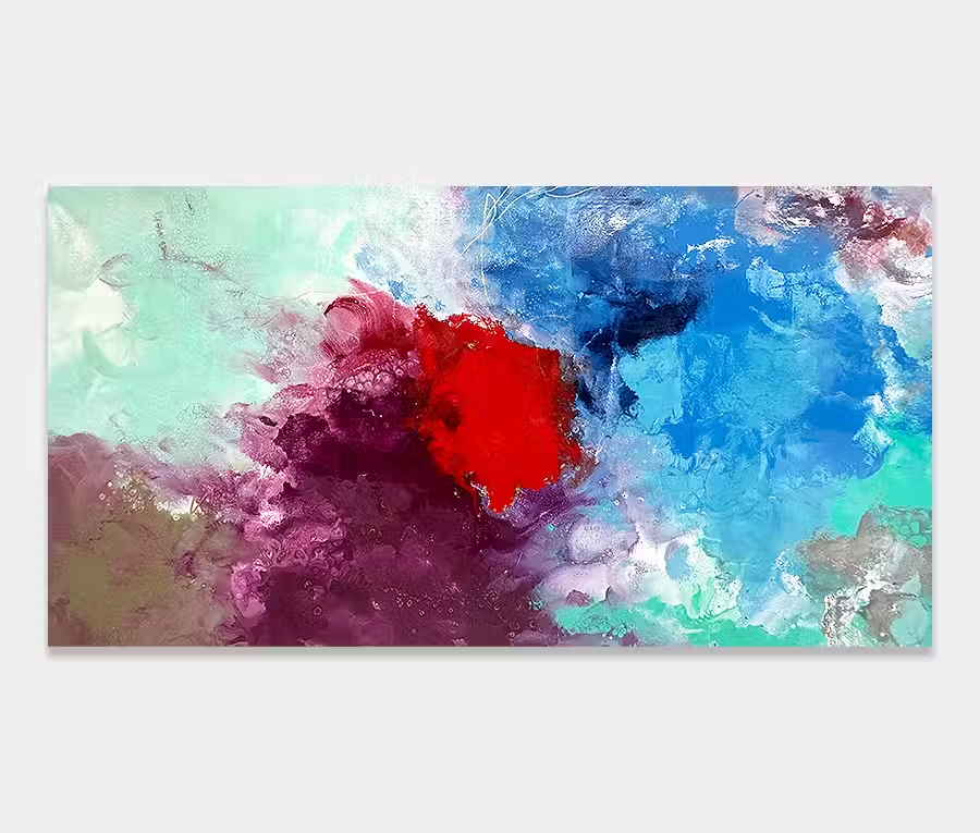
It is this need to join up the individual pieces that helped create the gap in the centre. Now you may think that this statement is rather at odds with itself and a little contradictory but I can explain my reasoning behind it. If I had sent the black cascading off to meet the grey and silver I would have no breathing space left. The whole painting would feel too dark and too oppressive.
Keeping the middle light has actually made the painting feel whole. So the separating of colour has actually resulted in it existing as a single entity, rather than a collection of parts. In some respects it feels like clouds parting after a storm – a sign that sunny days are here again perhaps?
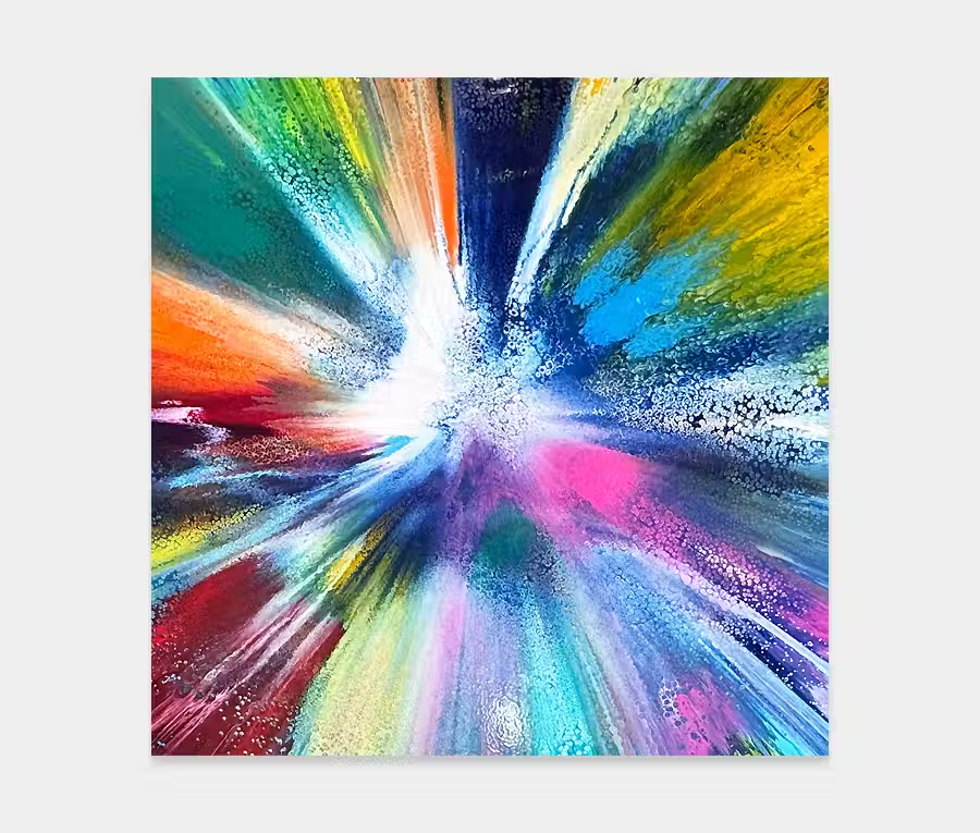
It is, however, the black paint that is the star of the show for me. There’s no way the painting would succeed without it and it has authority over every other element. But that doesn’t mean it is overpowering or without constraint; it is simply the bit that tempers the other bits. And with that little gesture of paint that looks like it’s escaping I get a sense of playfulness whilst maintaining order. I like that. Serious with a hint of fun.


")


")
")