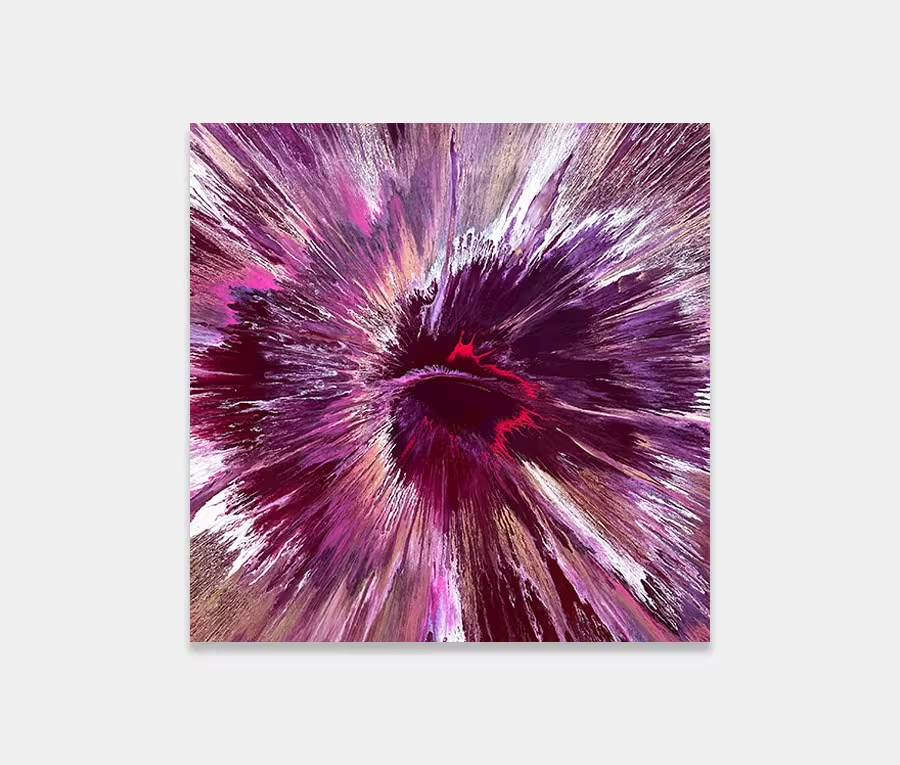
‘Sakura Spring’
is a large pink, red and gold abstract art work inspired Japanese Cherry Blossoms
200cm x 140cm (78″ x 55″)
200cm x 140cm (78″ x 55″)


This new pink, gold and red abstract painting is very reminiscent of cherry blossoms. In fact, its name is derived from the Japanese terminology for cherry blossom.
Although used in a wide variety of connotations (and has varying contextual translations) it’s inextricably linked to the spiritual connections of cherry blossom tress – even though Sakura is technically the name of the flower of the Japanese Cherry (Prunus Serrulata). Other varieties are also found in Japan.
It seemed a fitting name to a painting that wasn’t created with cherry blossoms in mind but whose name came after the canvas was stretched around the frame. That happens a lot.
As with all my original paintings I try to conceive its final look weeks ahead in my brain. I normally start with either a subject matter or a palette of colour. Then I move on to layering and construction. So, I may think about what density of colours will go where, what directions to move paint in and how the delicate balance between light and dark will play out.
When I have a concept, I am pretty much ready to go.
And so, to Sakura Spring. It’s clear to see how the light and dark elements play with each other here. We have maroon bordering the pink, as if to protect its fragility whilst repelling the lightness of the silver at the same time.
In opposing corners there’s a hint of black that gives way to red and it’s this that give the painting its depth. It’s never too heavy or unbalanced and all these components lead the eye to the spectacle that moves to the centre of the painting – the pink and gold.
And whilst there is no discernible focal point as such one can’t help but be drawn towards the middle. It’s like an actual cherry blossom itself really – there’s always the point from which everything else grows outwards.

In a similar vein to this I painted an original a few years ago called I Need Hurricanes which has become a personal favourite because of the reasons behind it. It’s well worth a read of the blog post I wrote about it too as that helps to explain why it was called by that name and why it looks like it does.
Anyway, you’ll get the idea and when you read about it and see that both these paintings have a resemblance to each other. I’ve long wanted to revisit the Hurricanes painting and at long last I have, albeit with a different angle and approach.
Well, if I do say so myself, it’s flawless and absolutely stunning in real life. I mean it. Try as I might to use a camera to capture it there is no substitution for being close to it. Textures, details, surface finishes, lustre, tactility – it’s all going on.


 North by Northwest