")
")
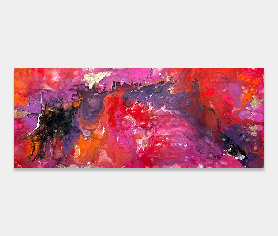
On a Wing and a Prayer
£3500
250cm x 90cm (98″ x 35″)
includes UK delivery and hanging
(Worldwide shipping available)
I created On a Wing and a Prayer with just a small selection of colours. The main one being a new yellow metallic gold – it has a really interesting tone and shimmers in direct light. Naturally I am drawn to it – I’m a sucker for shiny things!
But that is only part of the story here; the balance and gravity in the painting belongs to the additon of black and white – two extreme colours that have fused to create the most mesmerising range of grey tones I think I have ever seen. It really does make you want to get out a magnifying glass and have a look around.
Bring in the copper
Added to this was a rich metallic copper which has also produced, purely as a side effect, a verdigris effect as the paint thinners (liberally applied I may add) has accelerated the ageing process of the copper pigment (yes, real copper see!). I could probably write a thesis about just that alone but I will spare you the physics lesson this time around…