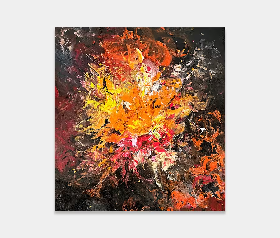
A medium sized mustard yellow and black painting
Drop in white and grey and flecks of copper and you start with a colour combination that’s moody and powerful.
Where you take it after that is the exciting bit.


Choosing colours
Mustard yellow, with all it’s shades and tones, is one of those colours that absolutely fascinates me.
I’m not sure if it’s the way it seems to fit with almost anything or whether it’s the richness of it that mystifies me; perhaps there’s something a bit deeper going on? Whatever the reason may be I know that it’s a colour that gives me enormous scope to try new things. For me there are is no better accompaniment than black, white and copper so that’s what we have in this rather interesting painting called Moon Child.
Why Moon Child?
I get asked about the names of my paintings an awful lot these days. In this instance it began a while ago when I heard the track (of the same name) by Iron Maiden. It was always a favourite of mine (from their vast repertoire) and for weeks afterwards I kept humming it in my head.
Eager to put this to good use I began to think about painting something that came to represent its literal meaning. But let’s not get all deep here – I am an abstract artist and I have a very loose style. If you want to attach any more significance to it then be my guest. I’m just going to keep it simple – if I could abstract out something moon-ish and maybe a bit fetal then this is what it might look like in my head.
Something to believe in
I mean, the moon doesn’t have children and I’m pretty sure there aren’t any that live inside it but let’s not dispel the myth completely – it’s nice to think there may be something out there after all, for all of us to believe in, no matter how much science and facts prove otherwise.
Still with me? Thanks, it may all sound a bit weird but I am not mad I assure you.
How it was painted
So having established that mustard yellow is one of my favourite colours and that I am possibly mad let’s look at the techniques I used in its creation.
One of the most critical aspects of this painting is the background layering. In order to show off the two main shapes in the foreground it’s vital I get the blending right underneath. If I don’t then your eye will struggle to make any coherent sense of what’s going on. Random and dissolved shapes are fine but not for something that needs definition like this one.
It was important to have areas of light and dark in the background as well as clever use of colours (you may also see elements of metallic silver and grey in there too). Blending some of the mustard yellow with other key tones sets up a foundation on which to bring the drama and action. Get the base wrong and the rest of it fails in a heartbeat.
Most of the defined shapes you see were poured on then maneuvered around using syringes and needles. This way I can suck up and re-deposit where I see fit. It’s a neat trick actually even if sounds a little odd.
What you can do with this painting
Well for starters you can hang it in any orientation because it is signed on the back. And that’s a good thing as you may wish to try the orientation that suits you best. It’s important for paintings like these – the ones that have a strong and well defined shape; it lets you consider four possibilities at once.