Let’s kick things off with a brief mention about the canvas I’ve used in this very big square painting. It’s a bit special. It’s a coarse weave, heavyweight Belgian linen. It’s comes from the factory of Damien Hirst and is a work of art in itself.
As this painting was created on a canvas that needed to be over-sized (compared to most normal ‘off-the-roll’ types) it was necessary to get some specially made. So I did. And it’s hand primed and is of beautiful quality. It really shows off the paints at their best.
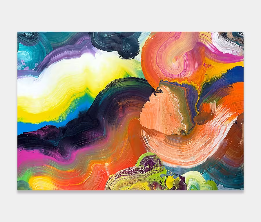
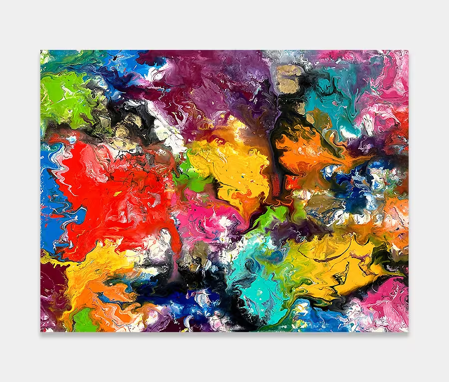
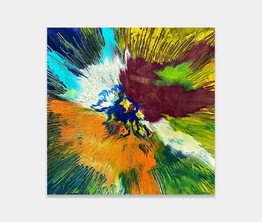
And so too with the choices of colour. From the start I was always going to make this a bright and vibrant work of art. Selecting the right colours really wasn’t a problem (I think I’ve pretty much chosen all of them to be honest), but what to do with them was.
I’d fancied doing something with a series of opposing curves for a while but needed the time and space to really get stuck in; an imperative requirement because of the size of the canvas I began working on – 270cm square. And considering I work flat on the floor you can work out how difficult it has been getting into the centre.
The painting is made up of curved lines. Some are constrained to each of the four corners and some, the crucial ones, are laid across specific points. This interweaving of sections is what brings the whole thing together. I’ve applied the colours and the movements in such a way that not only can you rotate the painting in all four orientations but that very process gives way to a revealing symmetry.
One of the benefits of working flat is that I can work all the way around the painting so I get to see it from all angles. This allows me to make sure that I get everything correct from every direction. It’s something I get particularly precious about on all my square paintings.
I also love the varying degrees of paint thickness too; in places it’s incredibly thick and glossy yet in others I have thinned it down and reduced the gloss. The combined effect of this is to offer a swift change in reflectiveness as light moves over the surface. Move one way then another and the textures become more apparent.
It is perhaps the colours though that really stand out. I’ve taken extreme care to balance light and dark and spread out the large and small areas so that nothing overwhelms. Standing closer in reveals how this balance is also replicated on a small scale as you begin to notice all the small details that I have worked in.
It’s this attention to detail that is less apparent as you stand further away from it; providing yet another side to the painting that you may not at first have realized.
Overall its big, colourful and a huge slice of originality that will never be repeated again. And if that’s not worth crowning off some big feature wall with then I don’t know what is.
")


")
")
")