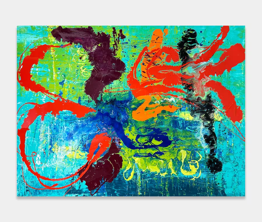
A piece of original turquoise and red art; crazy, mad and beautiful
I have never used these colour combinations before and certainly not with the degree of madness I normally entertain.
Perhaps then, this is what I find so compelling about this painting – I think my mind is constantly trying to piece it back together again!

THE STORY BEHIND IT
I’ve never painted a turquoise and red art work before. I’ve attempted it in a round-about way but never with any degree of satisfaction or enjoyment. In fact I’ve had this hanging in my studio for some time now – unsure whether I like it or not. In the end I decided I did and now it’s been photographed I am happy to put it onto the site. It’s a curious thing this love/hate relationship as creator. I should probably leave that for a more in-depth narrative at some point.
I had long had the idea of creating a series of paintings that celebrated apparent randomness and that carried a really abstract form, almost to the point of having no form at all. My grand plans resulted in just two paintings. One of these sold in November 2015 and was called Pandemonium. It carries a similar technique and application method but wildly different colours and backgrounds. They do come from the same batch of paints though even if they were spaced out several months apart.
I have always found turquoise a very calming and uplifting colour. When I think of something that it reminds me of it I go for tropical oceans and things like that. But any references to that kind of tranquility soon get abandoned when the mighty crescendo of white, red and black burst in on the scene.
There’s no getting away from the violence and chaotic explosion of colour that reaches into all four corners of the painting. No efforts are made to contain it or control it and that’s the beauty of the painting in my opinion; the abandonment of rules. I can’t really attach any kind of constraint to the painting as I can’t remember imposing any. Sometimes you just gotta let it all go.
Having said that I think the success of the painting also lies in the tools that I used to get the strokes and blends to form in the way that they have. Just enough movement without it becoming a dreary miserable mess. I suspect I shall plan more in this colour combination but I don’t see me doing anymore in this particular style. I fancy something a little more minimal with some angled blocks of colour and some faded out bits (that’s as technical as I get!).
At 180cm wide it’s going to fill a lot of spaces and because it’s not too big it won’t reach over and slap your face each time you walk by.
Mad but not insane; a combination of personality traits I am more than happy to live with.
")
")