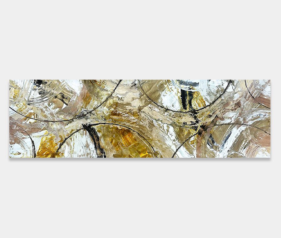
")
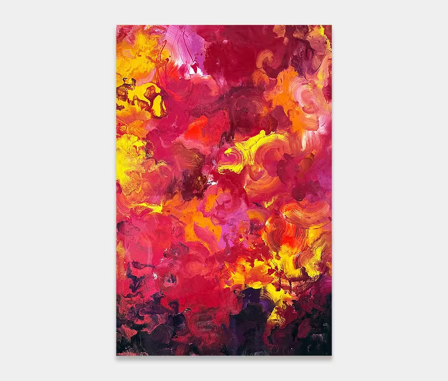
A slim, rectangular abstract painting with orange and blue colours
Cool blue, warm orange and feisty white bolt of lightning to break them up. Get the best of both worlds.
225cm x 60cm (89″ x 24″)
Cool blue, warm orange and feisty white bolt of lightning to break them up. Get the best of both worlds.
225cm x 60cm (89″ x 24″)
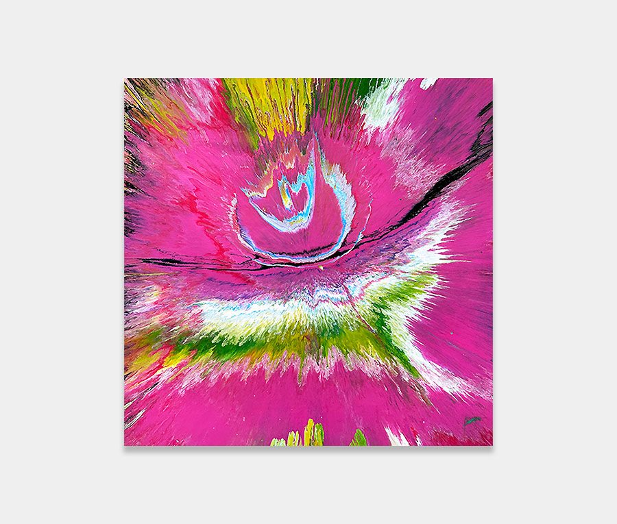
")
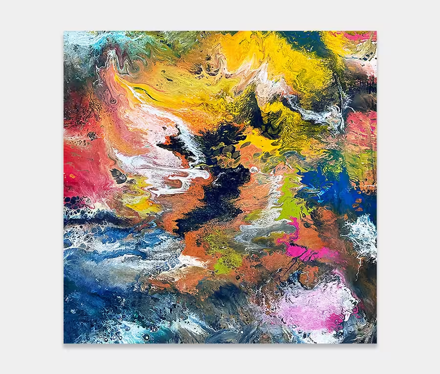
")
This is the first time I’ve used this colour combination. There is an obviousness of colour; orange and blue, but the inclusion of so much white and that all important calming in influence of maroon and burgundy have helped bring two contrasting colours together in one painting.
Orange and blue are two of my favourite colours but it’s the addition of a significant twist of white that really makes the painting come alive.
I have always liked orange and blue but can find that on their own they become a little overbearing. In order to launch them out of the canvas and develop their own personality they need to be complimented with a light tone. So that’s why the sharp and piercing white application was used.
I particularity struggled with the black directly underneath it as I wanted to lift the white streak off the surface a little to add some depth. I got it right though in the end and in the just the right places. I think if I’d have gone any further along it would have become too dominant. Always a tricky thing – knowing when to stop!
In the painting’s composition you can see that the underlying parts have been put together using regular, linear applications in small groups. The combination of these small groups form a singular mass that gives the overall shape.
And I have deliberately dragged tiny portions of each colour into almost every other part of the painting so you get very small nuances of colour in places you wouldn’t expect; the maroon-burgundy is a prime example – existing in all four corners in some way shape or form.
I like the openness of the blue and I like the stark contrast of orange as it marches defiantly on the opposing side.
It has an interesting contrast between matt and gloss finishes too; so as you move around it and watch the light change across the surface it opens up an additional quality. It’s impossible to show this in a photograph but take my word for it – it’s there.
I think that whilst this is a stark and bold artwork it’s a very grown-up and sophisticated one; partly because it doesn’t try too hard to get its point across and partly because of the use of regular shapes and a complimentary colour scheme.
It certainly won’t fight you for attention but will add a little solidity and maturity to the space it gets hung in.

 Bad Day at Black Rock