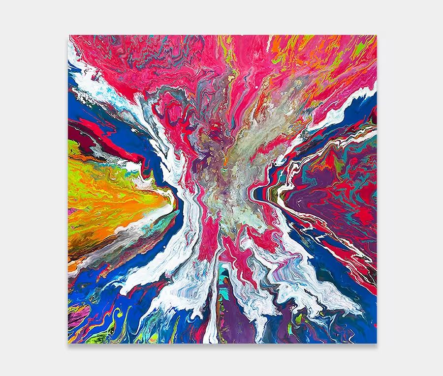
A large pink and blue painting with strong lines and soft blends
This is a painting that’s all about opposites. Strongly defined boundaries seek to contain the tonal shifts underneath. Amazing what you can do with just a few colours and a lot of practice. 180cm x 130cm (71″ x 51″)
SOLD
Pink and blue – what a combination!
I rarely use pink and blue in a painting as I have always struggled placing suitable colours with them.
Also, as I’ve never done anything like this before I knew I’d find it difficult to offer any kind of engaging story behind it or angle on how to enjoy it.
What I can say is that it’s a technique I’ve tried, but failed with, on a number of occasions over the last few years. I got this one right and have, at last, a way of keeping the very thick lines of paint static during the curing process (something that has eluded me thus far as the paint normally goes everywhere).
Creating lines
Each line is put in one at a time and, with a lot of attention (and back and forthing), I can now get them to hold their shape. And the lines are incredibly thick and rise above the surface.
Additionally each line is individually crafted to look different from its neighbour, with some inclusions of grey and silver and all manner of shapes within.
There’s a huge amount of thought and detail in this painting, so much so that I need to explain them all. Some of the close up photos show you some of the finer detailing in the lines. I’ve also angled the lines very gradually outwards from the centre so that they fall away at the edges (which is where you really notice the subtlety of this).
Building up the thick paint layers
The forthright and powerful line structure is in stark contrast to the delicate, thin layers that exist underneath. And what layers they are too.
Looking washed out in some places and heavy and impenetrable in others; it’s all part of the light and dark extremes of this painting. I love playing with the concepts of opposites.
I was a little worried that I would make this original a little too feminine (it’s actually very pink as I’ve included it in some of the black applications too), despite the leaning towards black. So in went some carefully chosen applications of a mid-range blue colour to bring it back into line. It’s had the effect of tempering the strength of the pink and allowed all the other applications a little room to breathe.
So after all that planning, execution and thought I’ve finally got a painting I have wanted to do for a long time and I have to say I’m delighted with it.
Whichever way it’s hung it’s going to be a room-stealer and despite it’s reliance on black as a foundation colour it’s surprisingly light and carefree so it’ll happily hang in a low-light space.
Free home viewing
You pick the art, we bring the gallery.
That’s right, you can stay at home, sit on the sofa and let the art come to you.
Pick as many as you want to see and only pay if you decide to buy.