")
A bright pink, and complimentary coloured, original line painting
Oh come one, we don’t all want dreary, dark paintings to look at all the time do we?
Sometimes you just gotta let go and celebrate the brighter things in life.
")
")
")
")
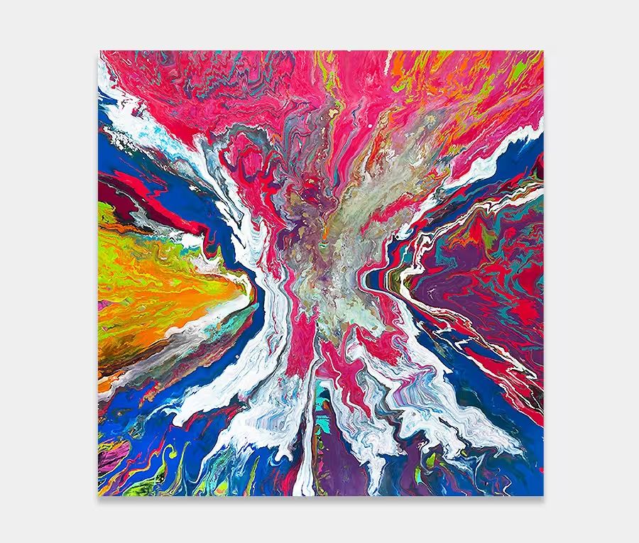
Pink. Can’t ever ignore a colour like that. And I have never seen at as feminine either as it happens. The reason is contextual.
In the right circumstances and with the right shade and balance it can add life to a painting like few other colours can. I regularly use it and although most of the time it’s blended subtly or offset against other more dominant tones I also like to go crazy once in a while.
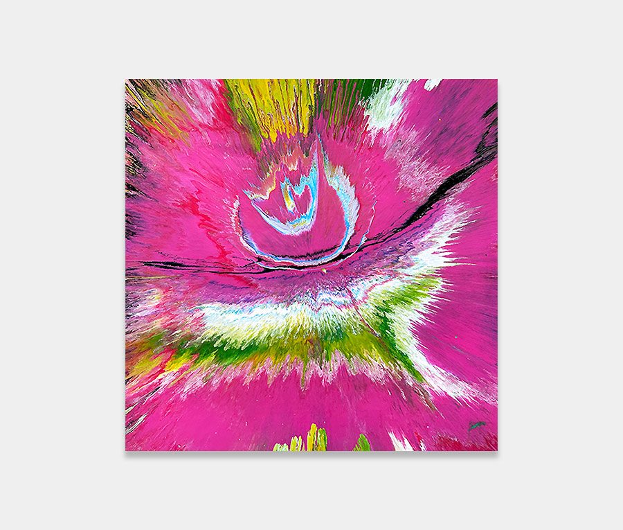
Now I know that this painting looks predominantly pink and it’s fair to say that there is a lot of pink in it but the very nature of it’s prowess is curtailed by the inclusion of calming purple and lilac shades. It’s also interesting that the vertical lines are a very strong and powerful shape so that helps to carry the dazzle of the pink layers away into a more fluid and moving statement.
I’ve been very careful to balance the light and dark tones too – I don’t allow pink to dominate the centre of the painting, choosing instead to let it filter out over the whole surface area instead. The great thing about doing lines and stripes is that one single line can alter the entire look of the piece so for that matter they are as stressful and precise as anything I do but when executed correctly the consequence is one of controlled exuberance and unparalleled joy.