What is This?
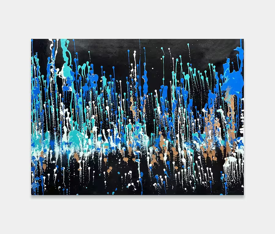
This is a black and gold abstract painting called Diamonds and Pearls. One of the interesting things about this new painting is a brand new technique I’ve been using to create some of the intricate details. The ability to put in such detailing is down to two factors.
The first one is the quality of the metallic gold paint that lies within it. The second one is the array of chemical additions that I put into the paint to allow me to move them into different patterns and shapes and create some of the effects that you can see in the photographs.
If we look at the quality of the paint to begin with, one of the features of the gold is the size of the metallic powder suspended within it. I’ve opted to go for a very small powder which allows the resin (in which it’s suspended) to move around the particles more freely.
This means I can chemically split some of this into very small and thin areas on the canvass. If I build up these small areas, one after the other after the other, with the application of special chemicals I can then begin to form some of the complex, almost cell like structures.
This is one of the techniques I use very seldomly in some of the works, but when I do so I tend to use it in quite an affluent profusion.
Using Black, White, Gold and Silver
My love of these colours is probably quite evident. If you were to look through some of the sold paintings in my archives you can see that there is a theme running through some of the monochrome works.
Whilst black and white is all very well and produces some stark and very stylistic works of art, it’s the inclusion of silver and gold that really brings these two tones alive. However, part of the challenge of using these four colours together is to do so in such a way that the gold and silver will temper the harshness of the black and white, but not put them in such abundance that it washes them away.
So, attaining a balance and an equilibrium is enormously important. I think you would see the inherent heaviness of a particular painting if too much black is used, or too much white, so these four colours have to be balanced very carefully. However, when you get it right it goes very right and I think with this painting, Diamonds and Pearls, that’s exactly what happened.
I have trialled this technique on a number of other canvasses and it’s gone very, very wrong. So, as part of my overall commitment to wanting to create the best art that I can, I often have to go through two or three practice runs before I can get something I’m happy with. Most of the time this is simply about making sure that my processes and my applications are correct, that the paints are mixed properly, have the right ratio of chemicals in them and, more importantly, what I see in my head I am able to translate out into the canvas.
What this Painting is All About
You can see many things in an abstract, especially one as stark and contrasting as this.
I see great movement going from left to right. I almost see a galloping set of horsemen riding out of the mist, coming straight towards me and yet, if I rotate the painting, I see something altogether far more subtle and more organic. So, you can really pull out anything you want from this kind of painting. What’s unusual about this one is its style of up and down and repeating movement.
If you look from the left hand side, it’s as if the movements gather some pace and gravity, really explode towards the centre and then as we come towards the washed-out ends on the right hand side, things calm back down again. There was a very deliberate desire to make the centre the focal point and not crowd the rest of the painting by doing the same at the edges.
The black is incredibly dense, the gold reflects light beautifully and the subtle mixture of white and silver (and other tones) allow me to create this almost ephemeral, ghost like edging that supports the main cast of colours in the middle. This is what I mean when I speak about balance. It’s having one thing happily existing with another and proving that you can put extremes into paintings, but still have them perfectly liveable-with on a day to day basis.
The lovely thing about this painting is that you don’t have to have a colour scheme in mind for it to fit into your life.
If you have any degree of white in your home, it’s going to fit in very well. If you have dark woods it will also fit in well, because of the gorgeously deep gold. If you have a very traditional interior it’s a great spike of modernism suddenly thrust upon you, but it won’t look out of place with a chaise-lounge or a Chesterfield.
The colour combination is a classic, but it gives you all the punch and all the wow of owning a piece of black and gold abstract art. You don’t have to work hard with Diamonds and Pearls; it does that for you. It’s comfortable and can fit into almost any environment and it’s not too big; something that not everybody’s walls can cope with.


")
")

")