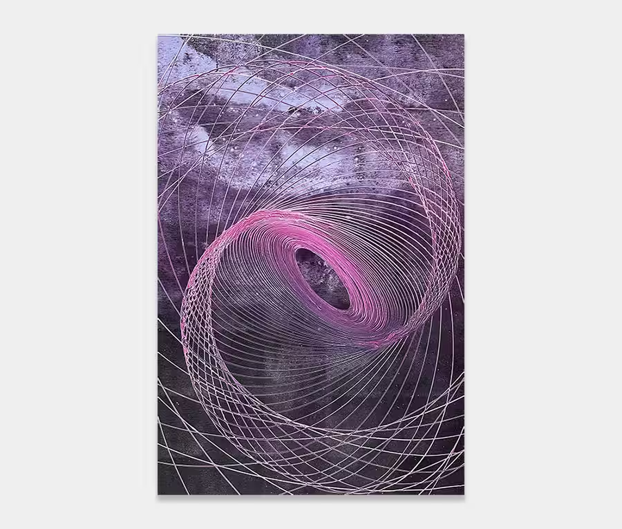
A light and airy blue and white original painting
It’s not massive so it can fit into most spaces and it’s every bit as good as it looks.
Proof that you don’t need to go mad to make your point or to enjoy a piece of contemporary art.
")
")

THE STORY BEHIND IT
When I set out to create art with blue and white I can never just leave these two colours alone. I have always felt that they need companion colours to bring the best out of them. So for this painting I am introducing slivers of red and pink, a metallic gold, some purple and several neutral shades of grey and black.
Creating some kind of structure for them was a lengthy process; when I lined up the pots of paint after I had decanted and mixed them I knew that I needed to go for something with order and form. Randomly dumping it onto the canvas and hoping for the best would have resulted in an awful mess. Sometimes colours do that for me – they dictate back to me what kind of painting they should be come. It’s a weird statement to make and one I cannot really explain but it’s there. A very definite feeling about what will work and what won’t. Besides, I also felt that the margin between getting it right an getting it wrong would be incredibly slim – any time I put pink and grey together I really have to be careful. Get those wrong and it’s over before you know it.
It’s the same story when it comes to placing the colours too. This is one of the reasons why there’s a big black line running through the centre. Try blocking that out with your hand and see what it does to the rest of it. Exactly – it becomes a washed out nothingness. Sometimes it’s the most subtle of additions that make or break a painting.
The same goes for the rusty orange blocks that appear in just two places. If the warmth is missing it’ll become that bit more tricky to connect with. I see this all the time in things like fabrics and wall-coverings. Sometimes it’s difficult to figure out why you’re not quite sure about something; warmth allows us a way in and it can demonstrate itself in a multitude of ways.
And by mainly using the basic colour combination of blue and white I felt it necessary to add some warmer colours to prevent it from becoming too cold and distant. We notice it in people all the time so I don’t think art is really any different. It’s a human thing isn’t it? We just instinctively know these things.
Interestingly the inspiration behind this particular painting came from a very desirable rug that was photographed and sent to me by one of my clients. It’s a thing of real beauty; its colours and the way it’s weaved caused me to become rather illuminated by it. You just never know where the next wave of inspiration is coming from sometimes. But when it hits you take it. That’s the secret for me – being able to spot something and paint it in my mind before I ever open a tin of paint. Over the years I have realised that it’s my brain that will make or break a painting – long before it’s ever committed to canvas.
If I were to sum up this predominantly blue and white art work I would say that it can very happily sit next to a window as much as it will hang in a hallway or stairwell. It will bring the joy of a contemporary painting into your world without the need to smack you in the face. I can see it having a sympathetic response to most interior decor schemes, thanks to it’s broad (but not over-powering) range of colours.