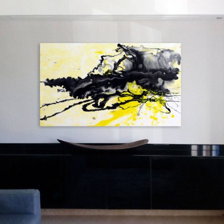
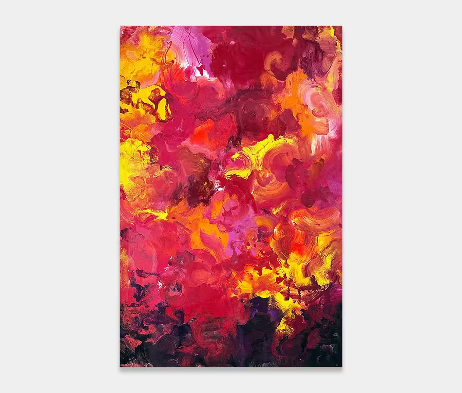
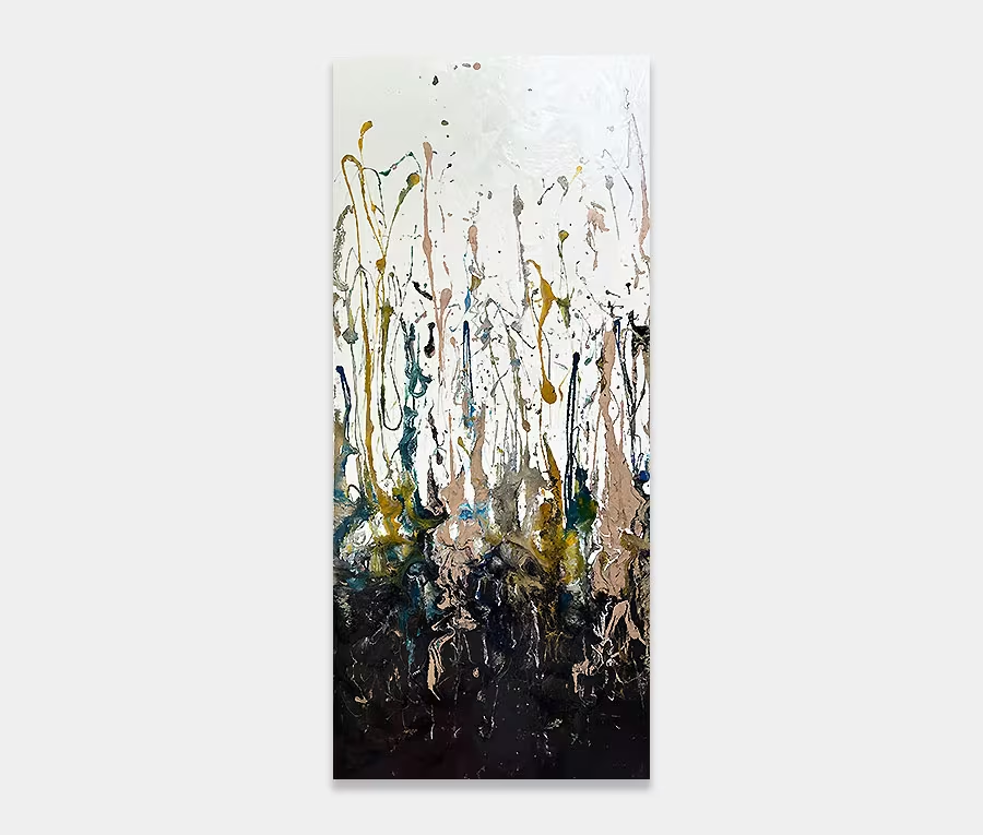
A small yellow and black original splash painting
Not a colour combination I use very often but when I do I make sure I bloody well go for it.
If your balls are big enough to desire a colour scheme like this then the painting should be equally dramatic.
Yellow and black? Seriously?
Yes, absolutely. Yellow and black are exceptional as a colour combination. There’s a very big contrast between the two and, if you get the blending right, it can propel itself up the dramatic scale very quickly.
It’s not a combination I would normally use but I had been itching to do something like this for a while. In fact, I painted this over a year ago but deemed it necessary to keep it hung in my gallery before posting it here on the site. I guess I just like looking at at more than I want to sell it.
Getting the colours to work
Side by side a simple yellow and black doesn’t really do a lot for me; things get a little mundane and boring without some careful thought. However, once you start making alterations to the lightness and density of these colours you get the beginnings of something rather wonderful.
Let me explain that last sentence.
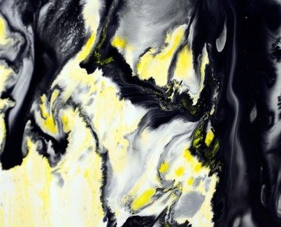
The success of this painting is down to the variations of black and yellow that I’ve used. You’ll notice I’ve washed out yellow to soften things up and also treated the black in a similar way to create a series of grey tones. These less dramatic shades ground the painting significantly – allowing the louder applications to sing and dance. You can’t really have one without the other in my opinion.
Techniques and methods
I could talk all day about that.
I’ve used a number of unusual application methods to get the paint onto the canvas and to go where I want it. The base layer was applied with a plastic spatula then the top layers were poured and spread. I also used syringes with blunt hypodermic needles to move the rivers of paint around (good for drawing back up the tube and redeploying).
Big on impact, small on size
Not everything I paint is large. Sometimes I consider the smaller pieces and see if I can translate some of the drama of the big ones into something a little more manageable. With Sunny Side Up I’ve definitely succeeded.
And as the photos show it’s more than happy to hang in any orientation; providing drama no matter which way it’s hung. As a conversation piece I think it ticks all the right boxes and on a personal note I reckon this one is a real gem. Maybe that’s the real reason I’ve hung on to it for so long? Perhaps I’d rather not let it go after all.
Oh well, bit late for that now. Pity I haven’t got any wall space left – if I had I don’t think we’d be chatting away like this!


