Supporting the main colours
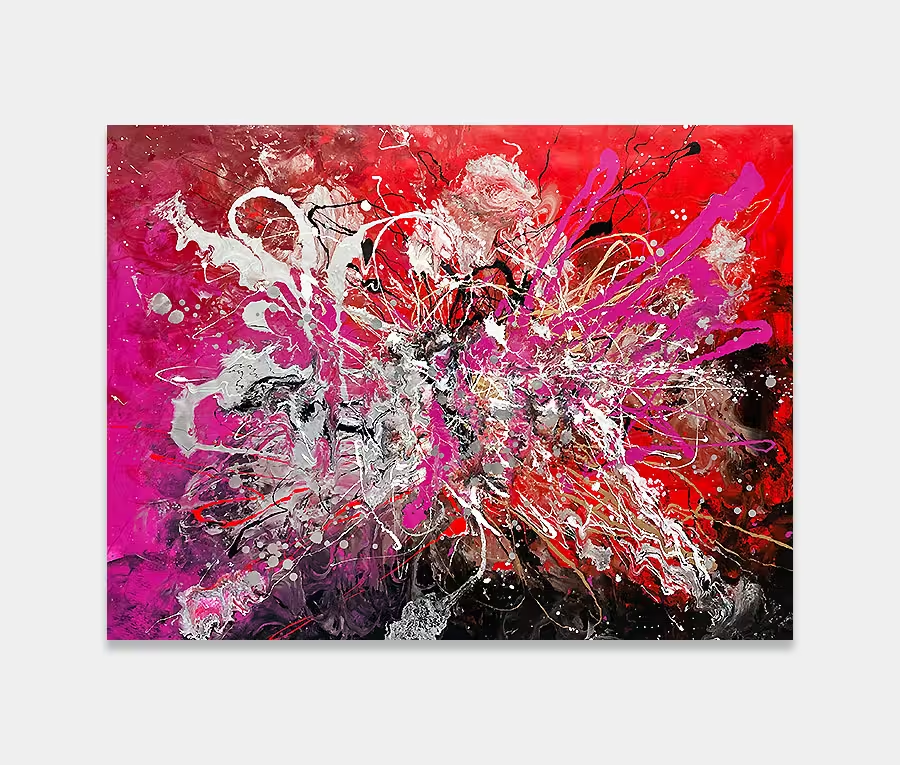
Behind every good story there are heroes that never get mentioned or that rarely get talked about. In this artwork that credit belongs to silver and white.
I’ve used a shimmering metallic silver for two reasons. Firstly because it’s gorgeous but secondly (and most importantly) it levels out the extremes of light and dark. I am a big believer in adding complimentary tones to even the most extreme paintings I create. This is because, at the end of the day, you have to live with them on a daily basis.
Doing something that’s mad, ridiculous or shocking is fine but would you really want to come down stairs each morning and see something that explosive as you switch on your coffee machine? See my point?
You can do something different, unique and expressive and still feel good as you walk past it. The sign of a good contemporary artwork is its ability keep giving but not to smack you in the face a hundred times a day.
Breaking the rules
As is usual for me I put detail in all my work. You have to give yourself the opportunity to get in close and have a proper look of course but it’s all there in one form or another.
I’m a big fan of angles I admit. I like the fact that there are rules to them so it allows you to put in a structure. But I also like the idea of playing with them and pushing them to form new shapes. It’s good to break some rules now and and again; hence the odd random white squiggle here and there.
I was tempted to go mad with them but there has to be a compromise I guess.
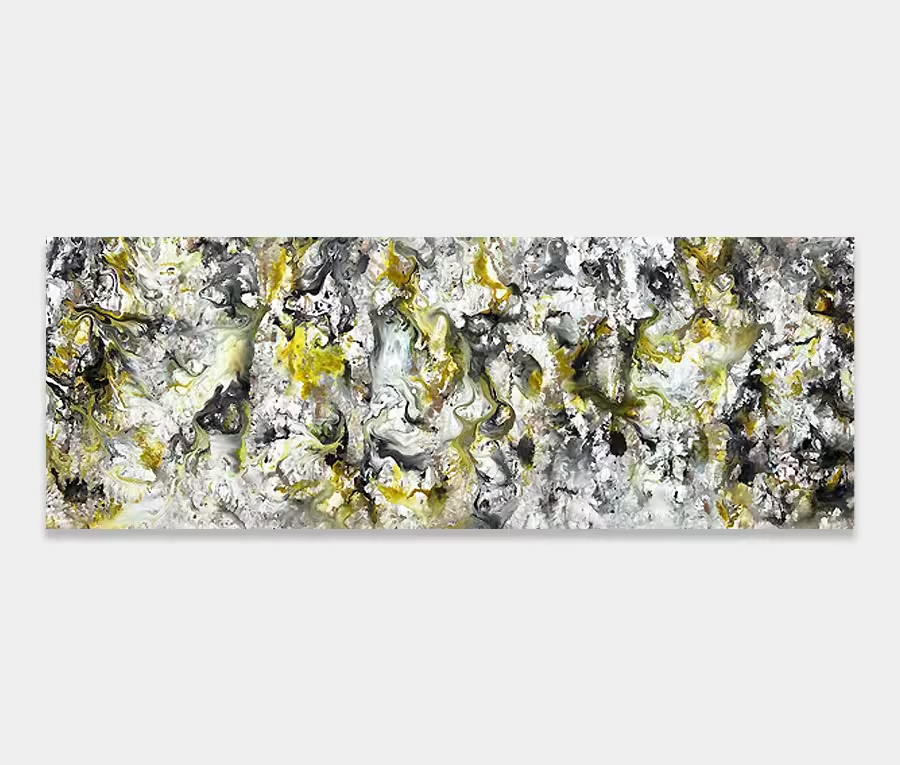
There’s no way the photos do this painting justice, despite my best intentions. If, like me, you’re a fan of neutral colour schemes and monochromatic colour ranges then drop me a line and let’s see what your feature wall is going to look like with this on it.


