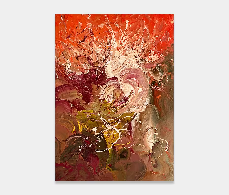
A medium sized piece of orange abstract art with accents of black, gold and silver
Take an airy base of creamy champagne and add some twists and turns of orange and black. Add features of silver, gold and red and bingo! We have ourselves something that’s bright, cheerful and a little bit edgy. 190cm x 130cm (74″ x 51″)
SOLD
This orange abstract art work…
…is very uplifting and light. It’s airy nature has its foundations in the beautifully blended background layer. A mix of champagne gold, rich cream and a cappuccino-like neutral help to set the stage for the main event – that delicious orange colour.
Getting the background right is critical in allowing the foreground colours and shapes to work. I spend a lot of time on base layers and am always looking at ways to fuse tones together to help compliment the top ones.
Warm and fruity
I’m a big fan of orange. In my line of work I tend to use it as it comes from the can; meaning I don’t mix it with other colours. I play about with shades all the time and like to get my colours mixed at source rather than try to mess around with them in the studio.
So with A New Day Dawns I have a new colour mix – it actually started as a Pantone colour but I’ve tinkered with the pigment ratios before it was mixed by my paint supplier – and it’s gorgeous.
This particular colour orange has a few darker elements to it than the normal ones I use. You still get all the razzmatazz of a bright orange but with a few rounded notes of warmth and an edge of intensity. It also has a subtle fruity tone (I promise you I am not mad!) and feels moderately zesty in its appearance. It’s not too shouty and never overbearing.
Think of it as drinking mulled wine, wrapped in a blanket watching a Kenyan sunset.
Paint effects
They are numerous. Detailing is critical to the success of a painting and this one is no exception, even though the main body of it is quite small in relation to how much of the canvas it covers. With that in mind it’s even more important to get the big applications right.
So we have all kinds of things going on – a click on the close up photos will illustrate what I mean. Gold and silver make make some welcome appearances to help moderate the power of the orange.
Small loops and sweeps dart back and forth; sometimes out then swiftly back in again. There’s all kinds of movement with the black being the colour that forces itself through the whole of the painting in a confident and committed direction.
This is why I feel it’s very uplifting – it’s as if the black is smashing through all that lies before it; it’s about growth, new beginnings and looking forward to the future.
Living with it
Easy. For starters there are no difficult colours or angry tones to contend with. Secondly it’s a nice manageable size so will fit on to a feature wall without it being in the way.
Additionally it has that restful and warm background so you can instantly place it in most neutral schemes. All you have to decide is whether you can live with orange and if that’s the colour you want to fill your space with. Go grab some cushions and a couple of throws and let me know. You’ll be surprised just how amenable this orange abstract art work really is.
If you’d like to see what this would look like in your own space I can pop it into a Photoshop render for you for free. It’s easy – send me a photo of your space (from your smartphone) and I’ll do the rest.
Free home viewing
You pick the art, we bring the gallery.
That’s right, you can stay at home, sit on the sofa and let the art come to you.
Pick as many as you want to see and only pay if you decide to buy.