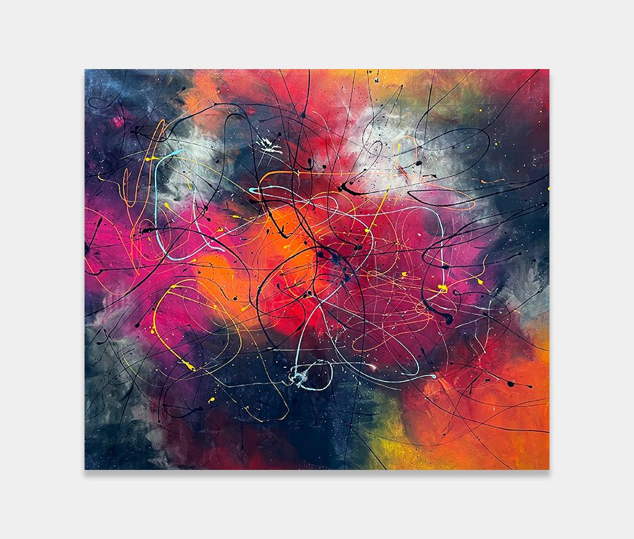
A vibrant and lively painting featuring blue, pink and black
I suspect this will be one of those paintings you either love or hate. Whatever your viewpoint you certainly can’t ignore it. Amen to that!
200cm x 130cm (78″ x 51″)
I suspect this will be one of those paintings you either love or hate. Whatever your viewpoint you certainly can’t ignore it. Amen to that!
200cm x 130cm (78″ x 51″)


This original painting definitely has two sides to it. On the one hand it begins with a light and bubbly foray into form with a carefully selected light grey and aqua blue to start things off.
That transcends into a cacophonous riot of dark blue and dense black as the painting leaps from playful to precocious in the blink of an eye. 
It would be fair to assume that this crescendo of madness lacks rules and structure but in fact you’d be wrong. Very often the more trippy and crazy a painting is the more care it takes to reign it in to something that makes sense.
So with Louder Than Words that’s exactly what we have. And the biggest and most obvious sign of that principle at work is the use of white around the outside.
The purpose of this is for containment. It’s fine to have all this waywardness and anarchy going on but if it isn’t tamed and contained it can send your brain into meltdown. Keeping everything under control, and defining the space where the madness begins and ends, is fundamental to pulling something like this off.
Boundaries must be respected and used properly otherwise people will get hurt.
Let’s be honest with each other here – you don’t have to make it into something just because it doesn’t remind you of anything. Abstraction can be tricky to get your head around if you struggle to just let things be. Bizarrely I am a lot like that – I like precision and straight lines and have to have control over my daily life.
But, in fact, I am also able to let go in equal amounts and I’m always astounded by how life gets so much better when I do. I use both elements in my paintings which allows me to be mad and sensible at the same time. It’s incredibly liberating. You should try it sometime.
So you don’t have to have a real-world anchor to ground yourself with this painting; all you need is to simply appreciate the colour shifts, directional flows, textural variations and minute details. The other stuff will come in time, I promise you.
This is how you should approach something you’re unsure or apprehensive about. It’s how you get below the surface to discover the real connection to something. And that should be on your own terms and in your own time. I’m just opening the door for you.
Well, you’ll need some space that’s for sure. I’d also say a few neutral tones would be handy – something like a natural flooring or some stone somewhere? Either that or it needs to be in a room where there’s literally nothing but white.
Personally I would hang it in landscape orientation and have nothing else around it (no console tables or lamps). It’s perfect as a hallway conversation piece or wherever a splash of colour is required or some light needs injecting.
A dining room is perfect as long as it’s big enough (we don’t want the kids having nightmares now do we?) and a galleried landing would be ideal. As it’s kinda big you’ll need some degree of open space elsewhere in the room to accommodate its presence.
So if you don’t want to go nuts on colour but need to be reminded that you have a pulse form time to time then this could be just for you. You can try it for free because I’m good like that. See below.

 Quantum Rainbow