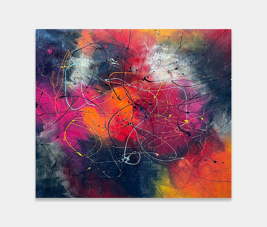
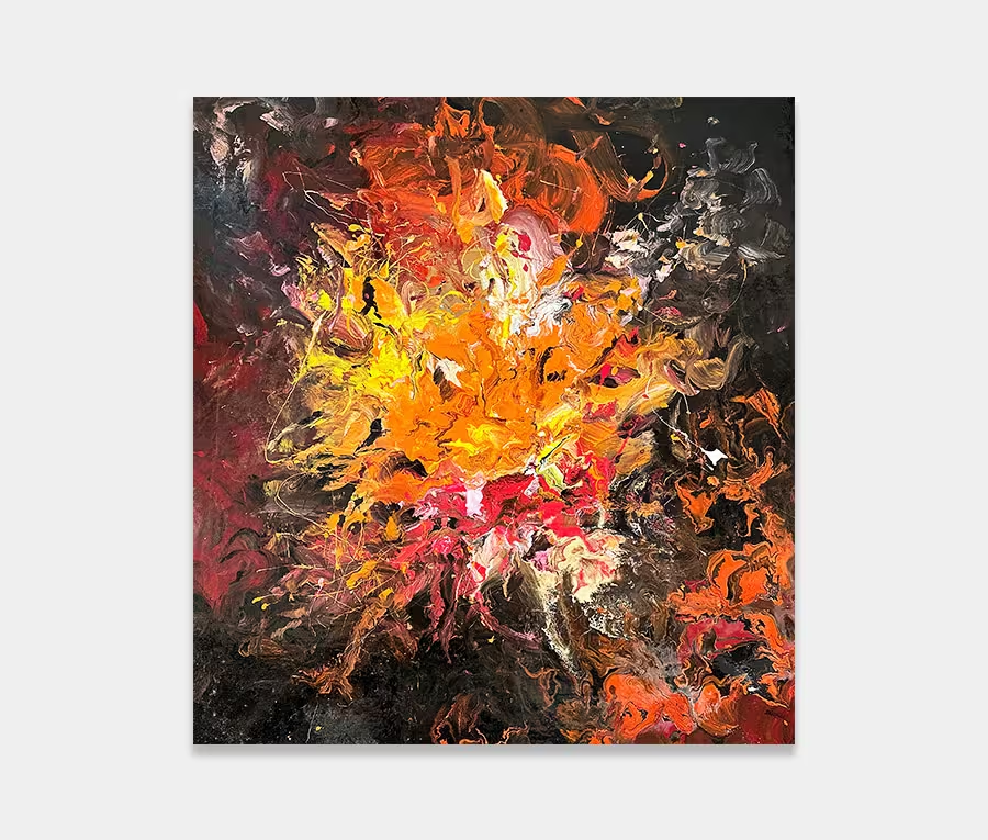
Orange is a colour I probably love the most. On its own it’s powerful, warming, comforting and full of life. There are many occasions when I partner it with purple or red as they fit together very well, especially in large blocks of colour. However, when I work on a slightly more sensible scale I can have just as much expression by using shapes to define the nature of a painting.
And that’s exactly what I’ve done here with Ascension. Using the theory of covering the canvas with orange to begin with I have then introduced a series of blended shapes and carefully chosen colours to weave a shape from one side to the other. One of the key elements to watch was the need to keep the orange present at all times and never let it be overtaken by the other accent colours over the top.
Bringing in a little metallic blue and a hint of black has brought some gravity to what would otherwise be a very light and wishy-washy affair. Interestingly the blue has also acted as a containment anchor (just a phrase I use in my head to define a single line that defines the space around it).
Boundary definitions are crucial to the success of my ‘swoosh’ paintings as they let all the paint applications on one side have as much fun as they want without spilling over the boundary line. In fact the two blue arcs that sit top and bottom are the two most important parts of the painting. They make it feel bigger than it is. Illusions are good, they can help you get the most out of things.
The paint is nice and thick, beautifully tactile (thanks to the layering technique I use) and the perfect size. It won’t overpower your space but it’s big enough to remind you that you own a vibrant and original piece of abstract art. This size of canvas is ideal above a console table, sofa or vertically hung in an open stairwell.

")
")
")
")