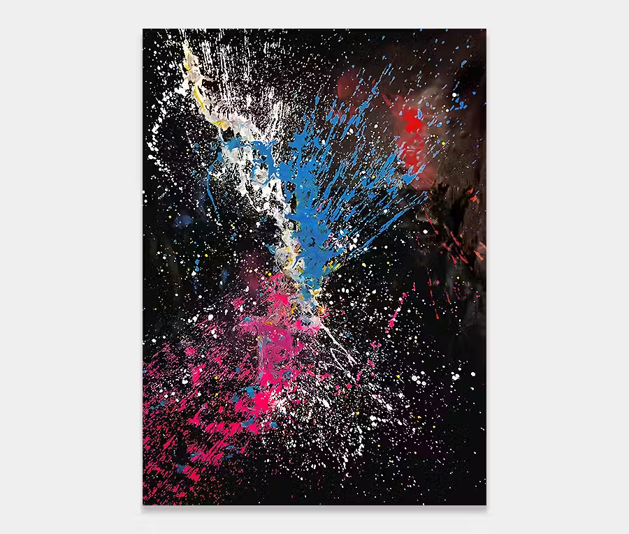
‘Xtravaganza’
is an incredible fusion of lime green and magenta – wow!
200cm x 90cm (78″ x35″)
200cm x 90cm (78″ x35″)
")

")
Xtravaganza is a large sized abstract painting created with a vivid pink (actually magenta) and a bright lime green. Added to this are black, silver, white and a touch of gold. For me, the real power of this painting is in the way that colours are put onto the canvas.
In this instance the main ‘X’ shape was done by literally throwing the paint across the canvas. Now, that may sound like a simple and carefree thing to do, but a closer examination of that principle reveals some rather unexpected stresses as I shall now explain.
The action of throwing a liquid out of a cup is not difficult, we all know that. However, that movement, when you’re trying to achieve somethings specific, is actually quite tricky. Consider this for a moment – the paint has to be the right consistency to begin with. if it’s too thick the ‘throw’ will never reach the edges. Too thin and the bulk of it disappears off the edge. So getting the right amount of paint in the right place begins with the correct consistency.
Once that feels right I have to consider the behaviours of the pant as it hits the canvas. And this is all about confidence and wrist action. Having practiced this a lot over the years I have a pretty good idea about what’s going to happen by now. So it’s critical that i get my arm at the right heigh above the canvas and then position my body at the right angle so that I can get a full range of movement with the cup.
Then I need to asses my start and end points so that the paint goes where I want it to. When all that is calculated it’s time to launch the contents of the cup. Get it right and you’re done – get it wrong and thew painting is over. Done. I have tried to correct splashes before but it rarely works out, so if it isn’t how I want it to be I have to start all over again. The stress is real folks, I feel it and it’s there. So these kinds of paintings are borne from a different perspective to many of the others.

This painting is layered with paint so that there is a distinction between foreground and background layers. At the front we have some delicate and elegant white circles and arc of paint that loop and twist around in a very relaxed way. They have the effect of centering the eye and bringing everything together. here’s also a touch of magenta in the loops too.
The other complimentary colours of silver, black and gold give the painting a little personality and warmth and in different lighting conditions can change the feel of the piece dramatically. It’s just enough of a hint to add another layer of intertest to an already dramatic painting.
")

")

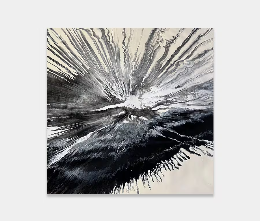
 Airscape
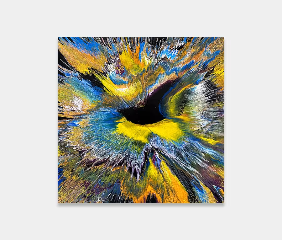