The Weight of Your Words

purple and gold painting

An effortless purple and gold modern art painting with black and silver accents

I probably shouldn’t open my mouth and start speaking because it might spoil the relaxed and happy thoughts that this painting creates. But ever the gob-shite, here we go….
190cm x 85cm (75″ x 33″)

SOLD

long purple and gold painting and sofa
gold and purple paint on canvas
purple enamel paint

Don’t panic!

Understanding modern art needn’t be a complicated affair. In fact, when you get it right, it becomes a very pleasurable experience. This is both true form a viewer’s perspective but equally so from the creative one too.

This latest purple and gold painting is a brilliant example of what happens when both those boxes get ticked.

Simplicity and complexity

This painting is very easy on the eye. It’s gentle and serene nature is achieved in two ways: firstly by the inclusion of some beautiful colours that are both harmonious and reassuring. A deep, rich purple is complimented by a warm metallic gold and hints of bright pink.

Fused with this are black (to help give depth to the painting), grey (to ground the composition and give it an earthy foundation) and white (to help define the line structures and bring light).

The second reason why this works so well is the shapes. At its heart it’s two soft arcs that meet at a central point. That’s it. But don’t get fooled into thinking you can roll out of bed and paint something like this before you hit the floor – I have often said that the more elegant and uncluttered a painting becomes the more time and effort goes in to it. And in The Weigh of Your Words that could never be more true.

gold and purple modern art

Getting the most out of it

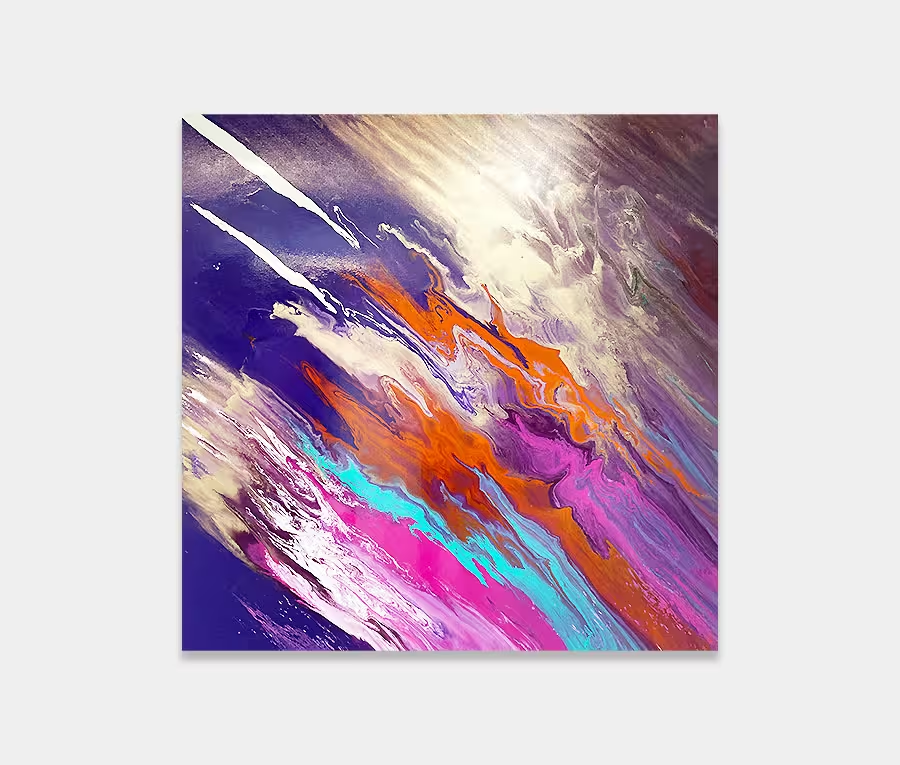
Each loop of paint on this purple and gold modern art work is a carefully balanced mix of chemical wizardry. There’s never too little or too much of anything and there’s a beautiful balance in how (and where) the paint applications are placed upon the canvas surface. Both loops join in a contained frenzy in the centre –  like a mini explosion, and one that is packed full of tiny detailing.

The whole composition is painted on to a background of metallic copper, grey and black and this has been deliberately created with a staccato effect – meaning that I have kept the initial paint blends as they were done with a 4″ plastic spreader. I chose to leave this raw state rather than smooth them out like I normally do. I think the painting needed that to stop it from falling away into obscurity.

Give me gold!

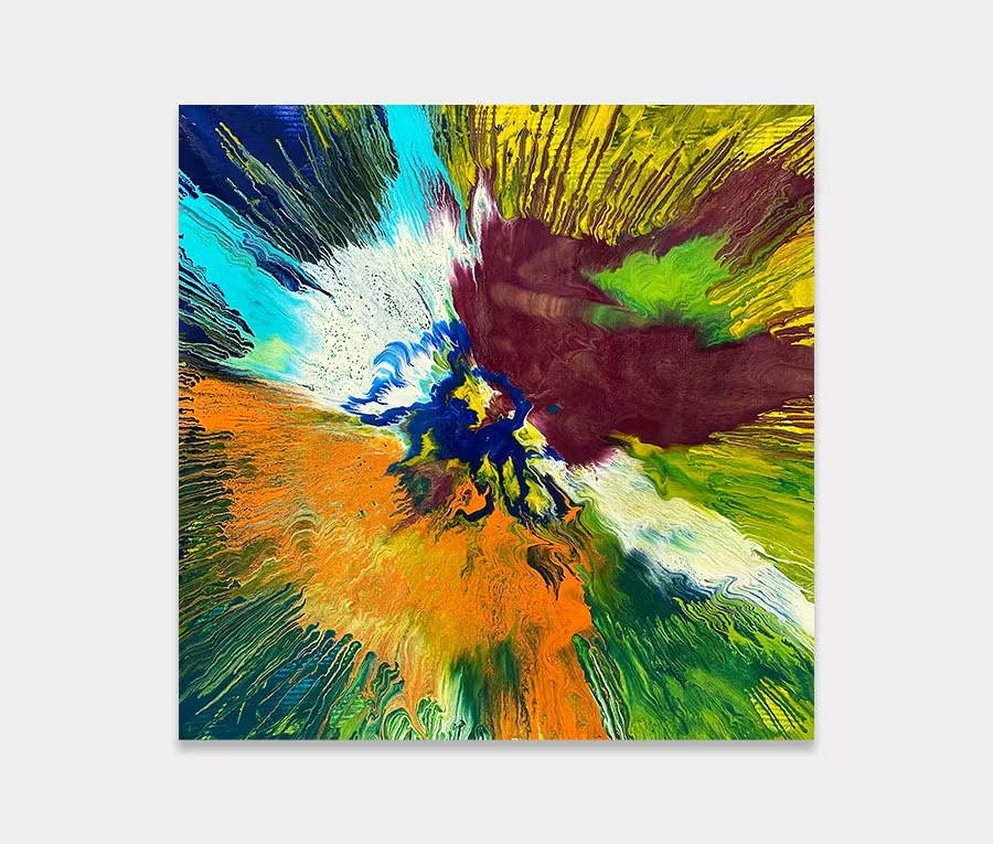
Closer inspection reveals the textures that I have layered repeatedly into the gold paint. This particular mix has some incredible properties and is unlike any other I have. I can build up layers within layers to create valleys and chasm of paint and, as this is a metallic, the result is something spectacular when light bounces off it.

Can you live with it?

Yes! The combination of purple and gold are perfect for generating feelings of restfulness and warmth whilst promoting self-worth and celebrating your individuality.

It’s always reassuring and will never wrestle you to the floor. And unless you’re hell bent on turning your space orange or mustard yellow this is likely to fit in almost anywhere and with any interior colour scheme.

Its shape is perfect for behind a sofa or above a console table. Personally I’d get some reflective surfaces nearby like mirrors or mirror-plated furniture or even the odd bit of stainless steel somewhere.

Free home viewing

You pick the art, we bring the gallery.
That’s right, you can stay at home, sit on the sofa and let the art come to you.
Pick as many as you want to see and only pay if you decide to buy.