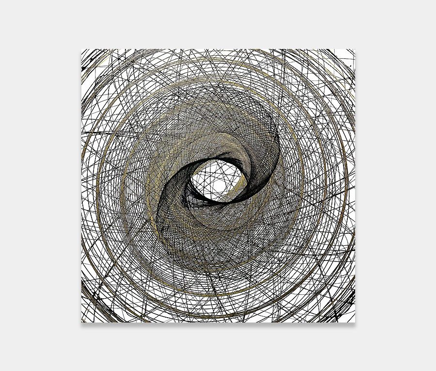
This is a contemporary spin painting created with raspberry, cream and black paints
Colours you can almost taste and a series of circles that you could literally step in to. What else could you possibly want?
130cm x 130cm (51″ x 51″)
Colours you can almost taste and a series of circles that you could literally step in to. What else could you possibly want?
130cm x 130cm (51″ x 51″)


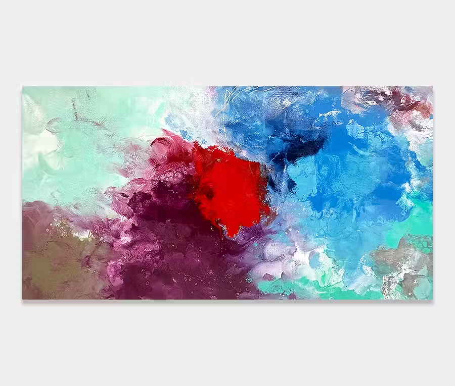
For someone with a big mouth and endless supply of things to say I am remarkably quiet about the colours in Robots Don’t Cry. I think this is because the colours (and the ratios they are applied in) are so far in excess of my expectations that I prefer to just look at them rather than talk about them. 
My mind can’t recall having been this excited about 6 pots of paint for a long time. I mean, just look at them – is it just me or do the words gorgeous and wow keep appearing in your mind?
I’m not suggesting you fall in love with the painting but simply to measure your own reaction to the brilliance and lustre of the colours I have used – it’s one hell of a combination.
Raspberries and cream anyone?
In my own opinion it’s the raspberry-into-black ring that contains all those amazing striations of colour. The bit I’m talking about is the dark area before you reach the red circle.
I had actually painted the dark circle without anything over the top but after adding the red one I soon realised it was sucking you in far too much. I mean, black holes are great and all that but I don’t want one hanging on my wall!
So in came the crazy raspberry features over the top. I mixed in a little pink here and there but the entirety of the circle is just one shade of raspberry red and black.

The paintings always come first and the names arrive shortly afterwards. Giving a suitable name to a painting, especially an abstract, is very important. It gives weight, context and authority.
It can be difficult though and is a similar problem that instrumental musicians can have when naming music tracks with no vocals (the ones I’ve spoken to anyway).
However, I have broken with that tradition and done things the opposite way round on this occasion. I had the name for a long time before I painted – even before Jean-Michel Jarre named a track on his album Equinoxe Infinity with the same title!
The name shaped the painting. That rarely happens.
All I ever kept thinking about when I committed to painting this was the HAL9000 computer in 2001: A Space Oddysey. Worth a read if you don’t know what I’m referring to.
The colour palette is so adaptable it’s untrue. Neutral schemes will love it because it’s a quick splash of colour and the statement you need to bring your newly renovated space alive.
It’s happy with grey as much as silver and gold and if you want to theme a space then bring in accents of orange, red, purple, lilac, pink and charcoal greys.
It isn’t too big either so there’s probably a wall in everyone’s house that could take it – it’s rich, vibrant, dimensional and beautifully executed. I seriously want to take it home for myself.

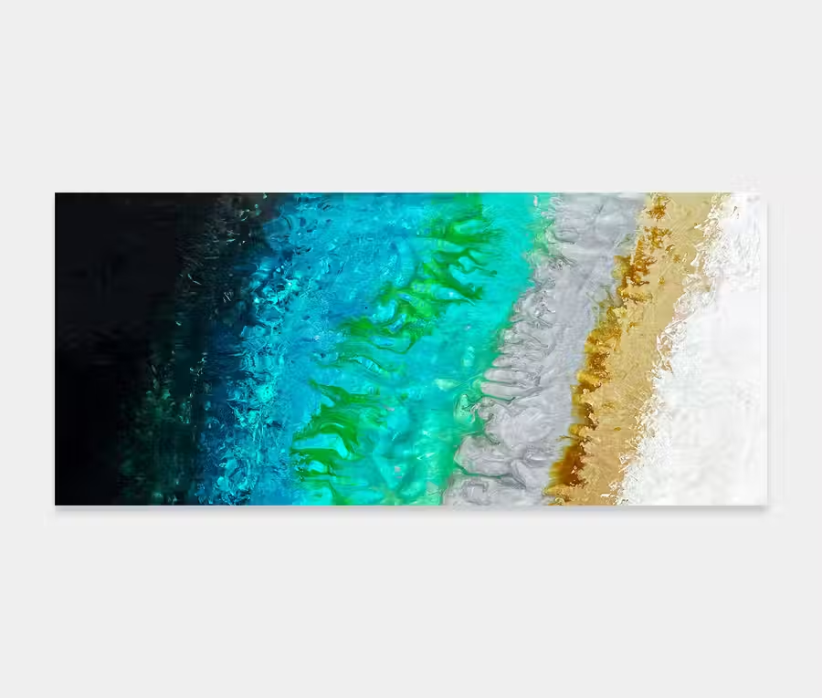
 Blue Polls